I was asked to design the poster for an art exhibition at the Science Museum in London.
The exhibition was a chance for staff at the museum to show off their creative pursuits. I work part-time at the museum and, as a friend of mine pointed out to me, most staff have their own 'slash', as in Exhibition Facilitator / Illustrator or Front of House / Designer.
The exhibition featured all sorts of artsy goings-ons, taking in fashion design, painting, comics, fiction and music, and it was fantastic to find out what my various colleagues get up to in their non-museum hours.
I rather stupidly forgot to take any photos, but here's the poster.
That's Francis Bacon lurking in the bottom right outside the museum. As it happens the next week I went to Dublin and saw his studio, recreated in all its chaotic glory at the Hugh Lane Gallery.
I feel a little bit torn about this. On the one hand they've made Frankie's studio into a really interesting exhibit. On the other hand, I can't help but feel that the act of minutely reassembling an environment that was a testament to bloody minded chaos is supremely missing the point!
Anyway, when I fancifully put Francis in the picture, I hadn't realised that his studio was in fact around the corner from the Science Museum in Reece Mews, South Kensington.
Wednesday, 27 March 2013
Wednesday, 13 March 2013
O to be in Beijing!
I am exhibiting four pictures at the O Gallery at Ogilvy Beijing.
This is part of the Image Makers exhibition, all helmed by the amazing Fei Wang, leader of the Flotian collective, mainly but not exclusively made up of artists from my Illustration MA at Camberwell. I'm very happy to be on show in such great company.
I wish I could go see the exhibition in person, it looks suitably swanky. Check out the chandelier!
This is part of the Image Makers exhibition, all helmed by the amazing Fei Wang, leader of the Flotian collective, mainly but not exclusively made up of artists from my Illustration MA at Camberwell. I'm very happy to be on show in such great company.
I wish I could go see the exhibition in person, it looks suitably swanky. Check out the chandelier!
Wednesday, 20 February 2013
10 minutes with...
...Moi?
I spoke to Chatham House's current affairs magazine The World Today about my graphic poem Capital City. See below for a (hopefully legible) scan.
Thanks to Agnes Frimston for being interested, asking great questions and making the piece look so nice.
You can buy Capital City at my online shop.
Tuesday, 29 January 2013
Brave New World
Last week I entered the House of Illustration/Folio Society's competition to illustrate Brave New World by Aldous Huxley. I kind of presumed that I'd read the book at school but upon actually reading the novel I realised that we can only have read a chapter or two. It was a good excuse to finally read it, and I was surprised at how early it was written, 1932 if I remember rightly.
Below are my three illustrations and my idea for the cover design. I tried to incorporate an element of 'technical' drawing into each to get across the idea of a society that has become biologically and ideologically mechanised.
Chapter 1. The incubation room.
"The bulging flanks of row on receding row and tier above tier of bottles glinted with innumerable rubies..."
Chapter 2. Fanny and 'Pneumatic' Lenina in their changing room.
"'Perfect!' cried Fanny enthusiastically. She could never resist Lenina's charm for long. 'And what a perfectly sweet Malthusian belt!'"
Chapter 14. The Savage in hospital, at his mother's deathbed.
"The Savage violently started and, uncovering his face, looked round. Five khaki twins... were standing in a row, puggily goggling at him."
Idea for the cover.
Below are my three illustrations and my idea for the cover design. I tried to incorporate an element of 'technical' drawing into each to get across the idea of a society that has become biologically and ideologically mechanised.
Chapter 1. The incubation room.
"The bulging flanks of row on receding row and tier above tier of bottles glinted with innumerable rubies..."
Chapter 2. Fanny and 'Pneumatic' Lenina in their changing room.
"'Perfect!' cried Fanny enthusiastically. She could never resist Lenina's charm for long. 'And what a perfectly sweet Malthusian belt!'"
Chapter 14. The Savage in hospital, at his mother's deathbed.
"The Savage violently started and, uncovering his face, looked round. Five khaki twins... were standing in a row, puggily goggling at him."
Idea for the cover.
Wednesday, 2 January 2013
Happy New Year from me and Storyhands!
Me and my chums at Storyhands (Natsuki Otani, Jenny Robins, June Sees and Martyn Warren) have made a set of illustrated postcards on the theme of New Years Resolutions.
We're sending most of them out to illustration commissioners but we have a few left. You can win a set by telling us your own New Years Resolution. Head on over to the Storyhands website for more details and to see more artwork: http://storyhands.wordpress.com/2013/01/01/new-years-epic-giveaway/#
Monday, 17 December 2012
Merry Christmas!
Merry Xmas y'all!
If you'd like to use this as your own Xmas (e)/card then be my guest (but please don't take my web address off).
Good luck and see you on the other side!
John
Tuesday, 27 November 2012
IF YOU DON'T WANT TO KNOW THE SCORE...
...THEN LOOK AWAY NOW!
***If you are an artist working on this project who hasn't completed their entry yet then read no further.***
I have a piece in John Miers' mind-boggling Comica exhibition, Score and Script. It's on at The Centre for Recent Drawing in Highbury (down the road next to the Tube where cars emerge from and try to run you over), London until 15 December. More deets on location etc here http://www.c4rd.org.uk/C4RD/Current_Exhibition.html
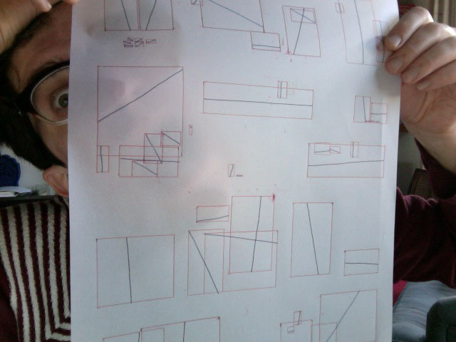
30ish comics artists have responded to John's ingenious research project on the language of comics, all part of his PhD research. John drew his own one-page comic and then came up with two ways of abstracting it, 1) a minimal 'script' and 2) a terrifying 'score' that looked like this!
I agreed to interpret the score foe my entry! Each of the red boxes is an 'actor', not necessarily a sentient character but an object that in some way has an impact on the progress of the story. The blue lines show the centre of gravity or direction of movement of each 'actor'.
I wrestled long and hard with this fiendish system...
...and eventually came up with the below. There are still some artists who are working on John's project , and as the whole point is for the results to be untempered by cross-contamination, we're not supposed to be projecting our artwork onto skyscrapers, but I hope he won't mind if I show it here.
***If you are an artist working on this project who hasn't completed their entry yet then read no further.***
I have a piece in John Miers' mind-boggling Comica exhibition, Score and Script. It's on at The Centre for Recent Drawing in Highbury (down the road next to the Tube where cars emerge from and try to run you over), London until 15 December. More deets on location etc here http://www.c4rd.org.uk/C4RD/Current_Exhibition.html
30ish comics artists have responded to John's ingenious research project on the language of comics, all part of his PhD research. John drew his own one-page comic and then came up with two ways of abstracting it, 1) a minimal 'script' and 2) a terrifying 'score' that looked like this!
I agreed to interpret the score foe my entry! Each of the red boxes is an 'actor', not necessarily a sentient character but an object that in some way has an impact on the progress of the story. The blue lines show the centre of gravity or direction of movement of each 'actor'.
I wrestled long and hard with this fiendish system...
...and eventually came up with the below. There are still some artists who are working on John's project , and as the whole point is for the results to be untempered by cross-contamination, we're not supposed to be projecting our artwork onto skyscrapers, but I hope he won't mind if I show it here.
Wednesday, 7 November 2012
Stoned!
Here's my entry for this year's Observer / Jonathan Cape / Comica Graphic Short Story Prize (and breathe!)
I wasn't enormously enamoured of the winner but the runner up by Banal Pig's Steven Tillotson is a corker. Read it here: http://www.banalpig.com/blog/
Friday, 26 October 2012
New Statesman
Capital City has been featured on The New Statesman website.
http://www.newstatesman.com/culture/2012/10/beautiful-comic-illustrates-ugliness-capitalism
This basically makes me the George Orwell of illustration, right?
http://www.newstatesman.com/culture/2012/10/beautiful-comic-illustrates-ugliness-capitalism
This basically makes me the George Orwell of illustration, right?
Wednesday, 24 October 2012
Capital City
Capital City was my big project that I made for my Illustration MA at Camberwell. I never seem to be able to leave William Blake alone and this was inspired in particular by his 'Prophetic Books'. In the same way as Blake explored the big issues of his day, eg the American Revolution, I decided to try to tackle the big, ugly mess of our current economic cock-up in a phantasmagorical, pseudo-mythological narrative. This involved reading and trying to understand some books on economics, writing poetry (bring me my flouncy blouse) and figuring out a new aesthetic, less indebted to my previous comicsy-style and more rooted in messy paint, pastels and ink.
I'd like to do a much longer version of Capital City in which I could get to grips with the central themes in greater detail, but at the moment, appropriately, I am skint, so I'm hoping that a broadminded publisher might come to my aid.
I've decided to put up the current twenty-page version on issuu here and below are some work-in-progress shots that give you an idea of the techniques behind the artwork.
You can buy a print copy of Capital City over at my shop.

(Weirdly, I actually know the person pictured in the newspaper here).
Ink and tea are my two favourite liquids.

Me and my print at our final exhibition at Camberwell.
I'd like to do a much longer version of Capital City in which I could get to grips with the central themes in greater detail, but at the moment, appropriately, I am skint, so I'm hoping that a broadminded publisher might come to my aid.
I've decided to put up the current twenty-page version on issuu here and below are some work-in-progress shots that give you an idea of the techniques behind the artwork.
You can buy a print copy of Capital City over at my shop.

(Weirdly, I actually know the person pictured in the newspaper here).
Ink and tea are my two favourite liquids.

Me and my print at our final exhibition at Camberwell.
Subscribe to:
Posts (Atom)